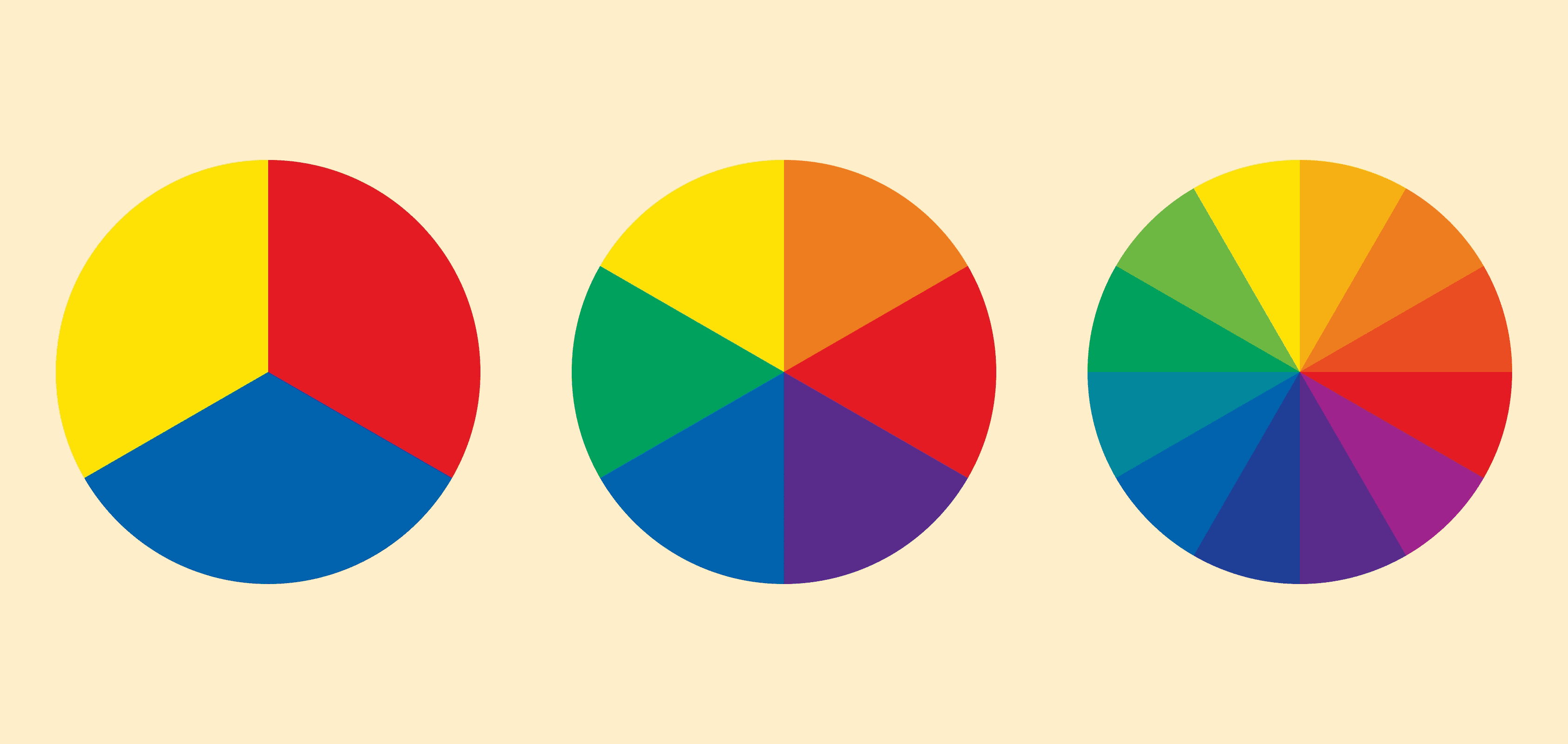
Let's keep it easy. Imagine a color wheel – it's like a rainbow in a circle. You have your main colors: red, yellow, and blue. These are the starting points. Mix any two of these, and you get another color: orange, green, or purple. Like magic!
You also have light and dark versions of each color. Imagine you have blue paint and you add white to it – it gets lighter. That's a light blue. If you add black, it gets darker. That's a dark blue. No need to make it more complicated than that.
This is where it gets interesting. Colors can really touch our feelings. Here are some common ideas about colors (but remember, different cultures and people might see them a little differently):
Red : This color means energy, excitement, and strong feelings. Think of fast cars, fire trucks, and sale signs trying to get your attention. Red can make you feel active, but too much can feel overwhelming or even angry. Some restaurants use red to make people eat faster and leave.
Blue : Blue means calm, trust, and safety. Think of clear skies, calm water, and the logos of many banks and big companies. It makes you feel secure. But too much blue can feel cold or distant.
Yellow : Yellow is like sunshine – it means happiness, hope, and creativity. It's a cheerful color. But sometimes, it can also mean caution or fear. Think of yellow warning signs.
Green : Green means nature, growth, health, and peace. It's the color of trees and plants. Many companies that care about the environment use green.
Orange : This is a fun and lively color, a mix of red's energy and yellow's happiness. It feels warm and playful.
Purple : In the past, purple meant royalty and richness. Now, it also means wisdom and imagination.
Black : Black is a strong and stylish color. It can mean power, elegance, or mystery.
White : White means purity, cleanliness, and new beginnings.
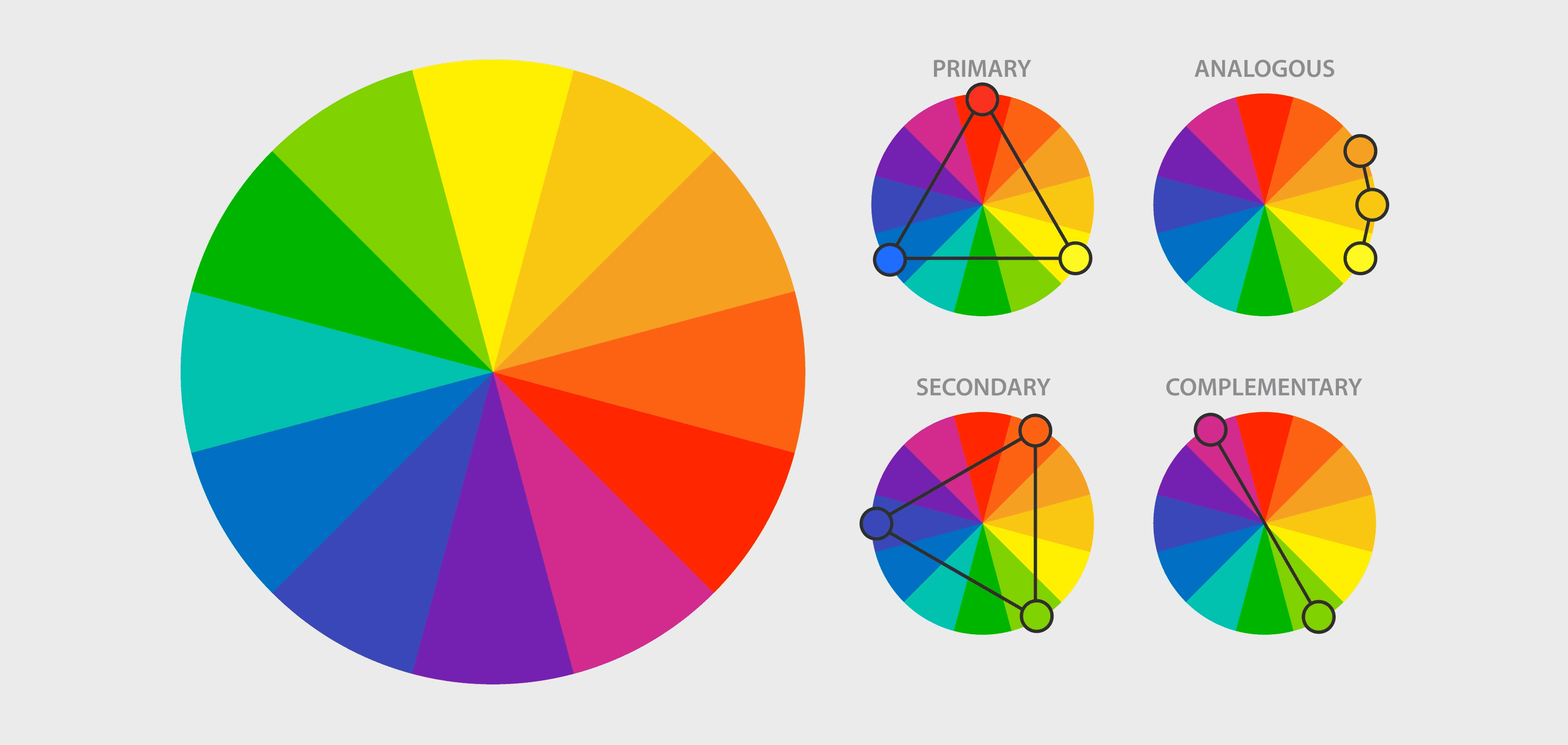
Colors become more interesting when you combine them. Here’s how:
Monochromatic : Stick with one color but use its different shades (like light green, deep green, and mint). It’s soothing and simple.
Complementary : Pair colors that sit opposite each other on the color wheel (like red and green). This combo creates a bold and exciting effect.
Analogous : Use colors next to each other, like blue, blue-green, and green, for a natural, calming feel.
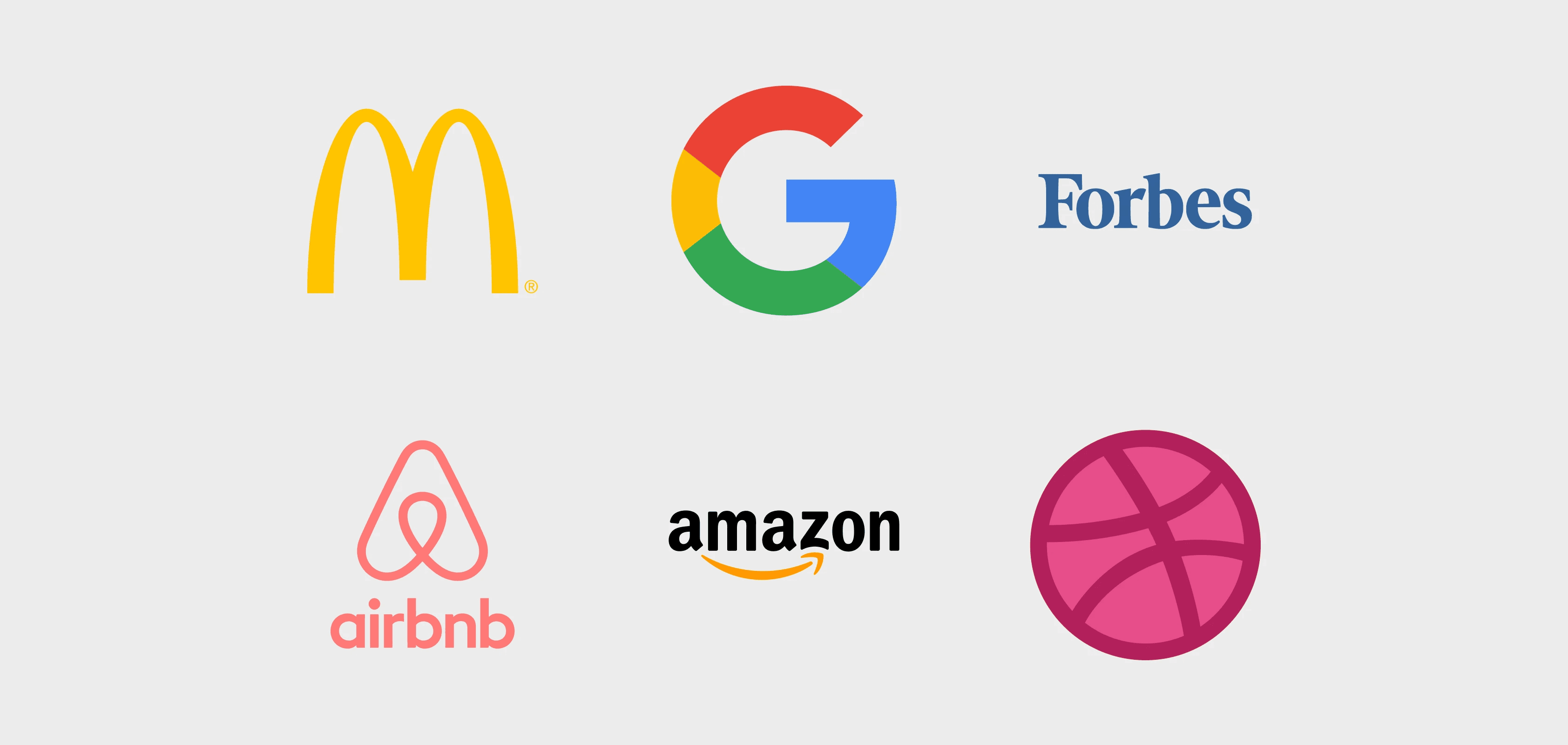
Companies use colors to show what they are about and connect with people. Think about McDonald's. The red and yellow make you feel hungry and excited. Facebook's blue makes you feel like it's a safe place. And Whole Foods uses green to show it's about natural and healthy food.
Adobe Color (color.adobe.com) : A good tool for making and finding color combinations.
Coolors (coolors.co): This tool makes random combinations that you can change.
Paletton (paletton.com) : This helps you make combinations that look good together.
Color is everywhere, and it changes how we feel and act. By understanding some basic ideas about color, you can see how it affects you and use it to make things look better, whether it's your room, your clothes, or anything else. So, pay attention to the colors around you!