The Power of "Just Enough"

Simplicity is at the heart of Google's design DNA. But as I mentioned before, simple isn't synonymous with easy. It requires a deep understanding of user needs and a ruthless commitment to prioritizing what truly matters. Think about the Google homepage. It’s a blank canvas with a single search bar. It’s almost shockingly minimalist, but that’s precisely its power. It immediately communicates its purpose: to help you find information. There are no distractions, no flashy animations, just a clear and direct path to your goal.
This principle extends to their other products as well. Take Google Docs, for example. It’s a powerful word processor, but the interface is clean and uncluttered. The focus is on the writing experience, not on overwhelming the user with a multitude of features. They provide the necessary tools, but they don't get in the way. This is a powerful lesson for us as designers: resist the urge to add unnecessary complexity. Strive for clarity and focus on providing users with precisely what they need, nothing more, nothing less.
Small Details, Big Impact
t’s the little things that often make the biggest difference. I'm talking about micro-interactions—those tiny moments of feedback that happen when you interact with a product. Think about the subtle animation when you like a photo on YouTube, or the way the Google Assistant responds to your voice. These small details make the experience feel more human, more engaging. It’s like a friendly nod or a reassuring smile in a conversation. They might seem insignificant on their own, but they add up to create a much more polished and enjoyable experience.
Designing for the Real World
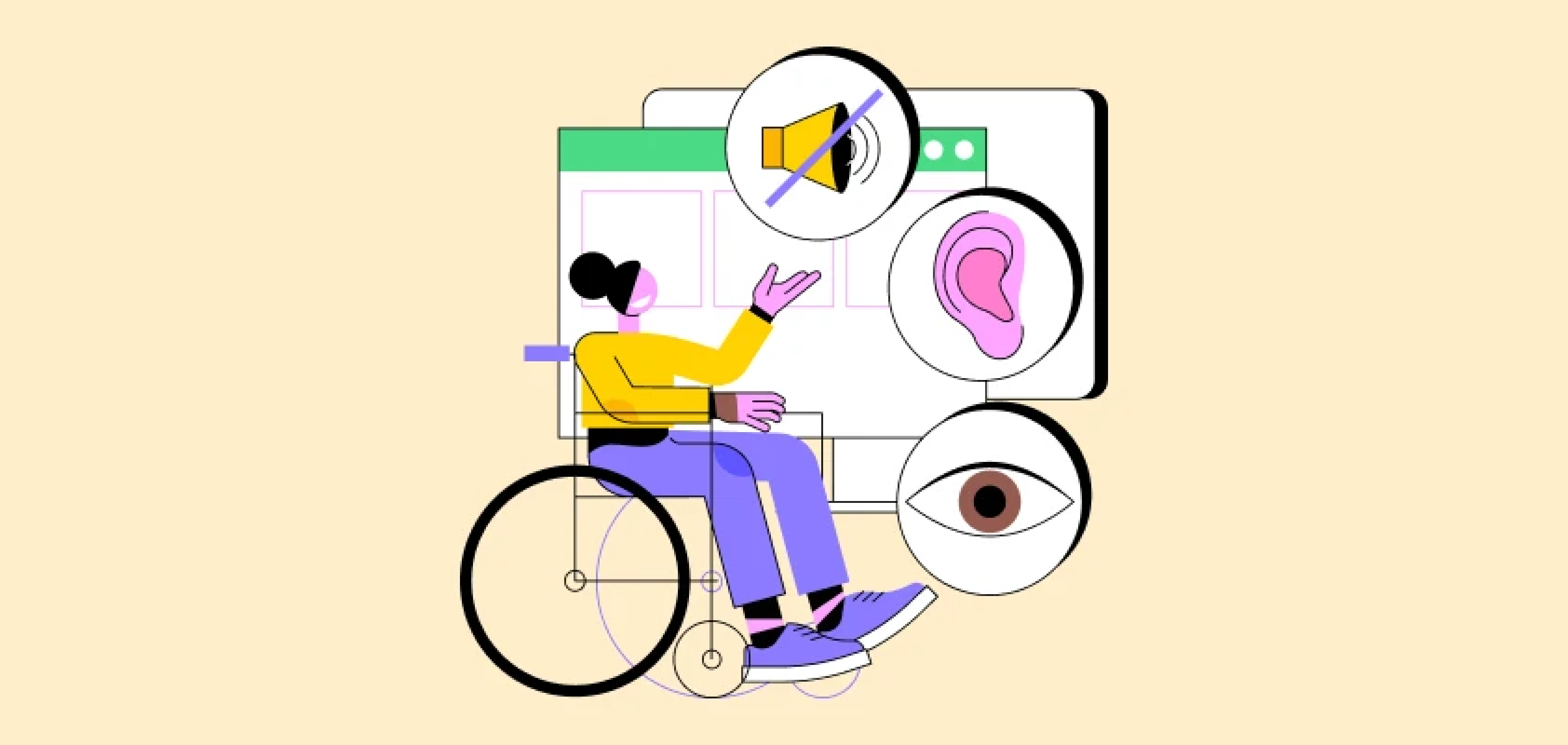
Google's products are used by billions of people worldwide, each with their own unique needs and abilities. This global reach necessitates a strong focus on accessibility. Google doesn't treat accessibility as an afterthought; it's baked into their design process from the very beginning. They adhere to accessibility guidelines, use clear typography and high contrast, and design interfaces that are adaptable to different screen sizes and devices.
This commitment to inclusivity is something I deeply admire. It reminds us that design isn't just about aesthetics; it's about creating products that are usable and beneficial for everyone. As designers, we have a responsibility to consider the needs of all users, including those with disabilities, limited internet access, or varying levels of technical proficiency.
Data as a Guide, Not a Dictator
Google uses data extensively to inform its design decisions. They analyze user behavior, conduct A/B tests, and gather feedback to understand what works and what doesn't. But they don't treat data as the ultimate truth. They understand that data tells a story, and it’s up to us as designers to interpret that story. It’s about using data to understand user needs and then using our creativity to find the best solutions.
Material Design

Material Design, Google's design system, is a great example of how they approach design as a continuous process of improvement. It's not a rigid set of rules; it's a flexible framework that's constantly evolving. They regularly update the guidelines and components, adapting to new technologies and user trends. This willingness to adapt and iterate is something I find incredibly inspiring. It reminds me that design is never truly finished; there’s always room for improvement.
My Key Takeaways:
Looking at Google’s approach has really shaped my own design thinking. Here are a few key takeaways I always try to keep in mind:
Keep it simple : Focus on what matters most.
Pay attention to the details : Small interactions can make a big difference.
Design for everyone : Make your products accessible and inclusive.
Use data wisely : Let it guide your decisions, but don't let it stifle your creativity.
Embrace change : Be willing to adapt and evolve.
